Displaying items by tag: map
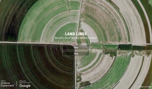
Land Lines
This Chrome experiment from Google lets you trace lines around a canvas, and automatically finds maps which correlate to your art.
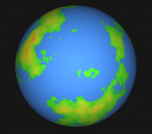
Map to Globe
Map to Globe lets you convert maps to globes, and can even re-project them and generate spinning animations. You can also just have the site create a globe on its own by giving it some parameters.
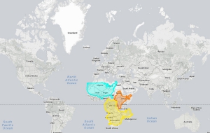
The True Size
It is hard to represent our spherical world on flat piece of paper. Cartographers use something called a "projection" to morph the globe into 2D map. The most popular of these is the Mercator projection.
Every map projection introduces distortion, and each has its own set of problems. One of the most common criticisms of the Mercator map is that it exaggerates the size of countries nearer the poles (US, Russia, Europe), while downplaying the size of those near the equator (the African Continent). On the Mercator projection Greenland appears to be roughly the same size as Africa. In reality, Greenland is 0.8 million sq. miles and Africa is 11.6 million sq. miles, nearly 14 and a half times larger.
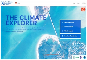
Climate Explorer
Explore maps and graphs of historical and projected climate trends in your local area. View data by topics to see how climate change will impact things you care about.


